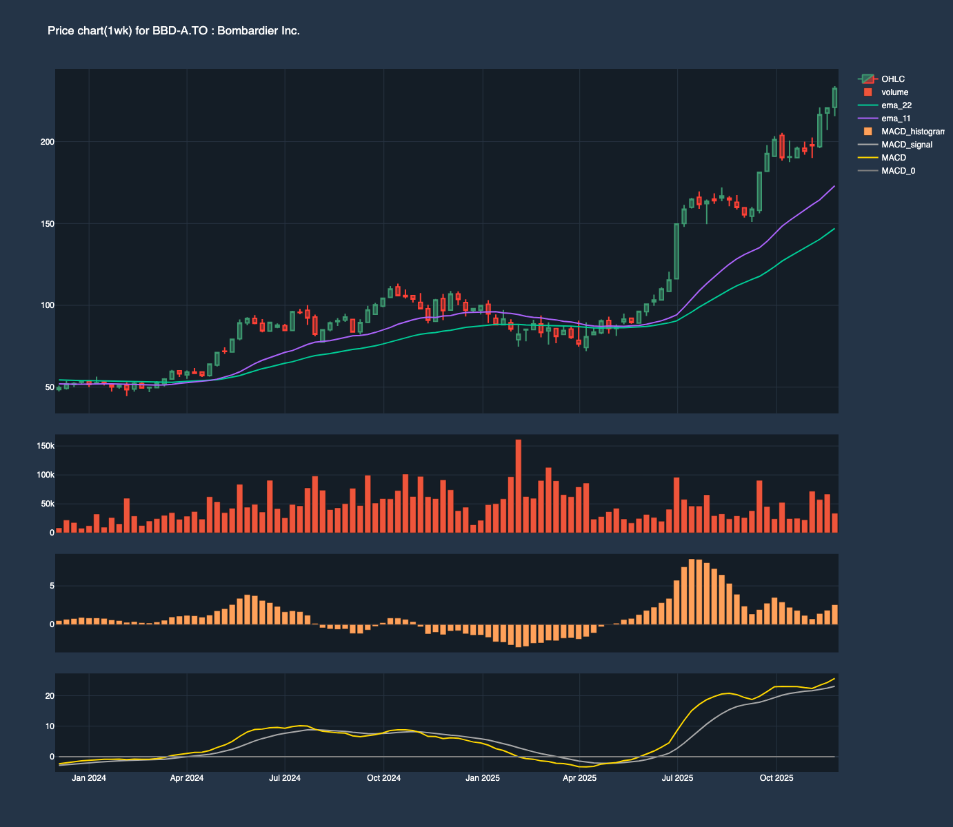
Like Tiny, Bombardier is just one of those Canadian company that I would like to own. And the trend was looking super solid on both the daily and weekly chart. So I just somehow decided to enter on 2025-11-131. I had no exit strategy since it keeps making new high, so my plan was to exit using a 3ATR channel which was hit on 2025-11-27 (highlighted in orange in Figure 1)
Figure 1: Daily Chart on 2025-11-11 (entry: green->, exit: orange->)
Figure 2: Weekly Chart on 2025-11-11
Entry
Given the small success of Figure 1, I revisited this trade on 2026-01-27, this time with a stop set at 228.21 based off of the “low” set on 2025-12-31 (marked by red arrow in #fig-daily-20260128). And I was more agressive staking 200CAD on this position.
Bot 5 shares @ 248.00 on 2026-01-27
Bot 5 shares @ 250.74 on 2026-01-28
Figure 3: Daily Chart on 2026-01-28
Stop
the Monday after, the stock gapped down and opened at 220 (a 2.9ATR move!). Since I used a stop-limit order, I was lucky and got filled higher than my stop at 230.00 (around 9:32, see Figure 5)
Sold 10 shares @ 230.00
Loss: 193.7 CAD
Figure 4: Daily Chart on 2026-01-30
Code
import yfinance as yfimport pandas as pdimport plotly.graph_objects as go# Example for a specific stock and date rangeticker ="BBD-A.TO"start_date ="2026-01-30"end_date ="2026-01-31"# Download minute-level datadf = yf.download(ticker, start=start_date, end=end_date, interval="1m", multi_level_index =False)# Convert UTC index to ESTdf.index = df.index.tz_convert('US/Eastern')fig = go.Figure(data=go.Candlestick(x=df.index,open=df['Open'], high=df['High'], low=df['Low'], close=df['Close'], name ="Price"))fig.update_layout(width =800, height =600, title='Candles for BBD-A.TO on 2026-01-30', template='plotly_dark' )
import plotly.io as piopio.renderers.default ="notebook"# compute volume profiledef get_volume_profile(data:pd.DataFrame, base:int=2, num_bins: int=20, do_round: bool=False):if do_round: df = data[['Close', 'Volume']].copy()#Round to nearest X df['Last'] = df['Close'].apply(lambda x: round(x, base))# Remove the date index df = df.set_index('Last')[['Volume']] df = df.groupby(['Last'], observed =True).sum()else:# We bin the prices and sum the volume for each bin price_buckets = pd.cut(data['Close'], bins=num_bins) volume_profile = data.groupby(price_buckets, observed=True)['Volume'].sum()# Get the midpoint of each price bin for the Y-axis coordinates volume_profile.index = [interval.mid for interval in volume_profile.index] df = volume_profilereturn dfdef add_volume_profile(fig, data: pd.DataFrame, in_place: bool=False): fig = go.Figure(fig) my_volume_profile = get_volume_profile(data = df, do_round =False)# display(my_volume_profile)# Trace 2: Volume Profile (Horizontal Bars)# We assign this to 'x2' so it can have its own scale fig.add_trace(go.Bar( x = my_volume_profile.values, y = my_volume_profile.index, orientation='h', name='Volume Profile', xaxis='x2', marker_color='rgba(100, 150, 250, 0.3)', # Semi-transparent blue hoverinfo='x+y' ))# 4. Layout Configuration fig.update_layout( yaxis_title='Price', xaxis_rangeslider_visible=False, showlegend=False,# Primary X-axis (Date) xaxis=dict(domain=[0, 1]),# Secondary X-axis (Volume)# overlaying='x' makes it share the plot area# side='top' puts the axis at the top (or hide it with showticklabels=False) xaxis2=dict( title='Volume', overlaying='x', side='top', showticklabels=False, showgrid=False,# range: Increasing the max range "pushes" the profile to the left# Here we make it occupy roughly the first 25% of the chartrange=[0, volume_profile.max() *4] ) )return figadd_volume_profile(fig = fig, data= df)
1
plotly’s volume profile is very sensitive to the price value selected, luckily I had the help of a coding agent for the addition of the volume profile.
(a) BBD-A.TO interday data on 2026-01-30
(b)
Figure 5
Learning
As Figure 6 shows, two weeks after breaking support the stock continues in its uptrend showing that:
if you are patient and ready, there will be opportunities to get into a trending stock
strong trend can break, setting stop at a reasonable level is key to avoid getting bumped out of a trade.
down side breakout like that show in Figure 6 might reveal what a good stop level is going forward2
Figure 6: Daily Chart on 23 Feb 2026, red arrow indicates when stop was hit
Tip 1: determining a reasonable stop
Gap size should be analyzed to see if the initial stop allows room for a “normal” size Gap down occurrance
the use of volume profile (as shown in Figure 5) might reveal a “popular” price level that could be used to form a stop
Footnotes
most likely with a stop at 189.87 at the slow EMA with 100 CAD at risk, which explains the 5 shares.↩︎
as L.TO shows, a few ticks below the obvious level might be wise↩︎